Increasing Booking Conversion

Improving healthcare service discovery and booking conversion

Improving top-of-funnel conversion by identifying user drop-off points and redesigning the booking experience.

Context & Problem

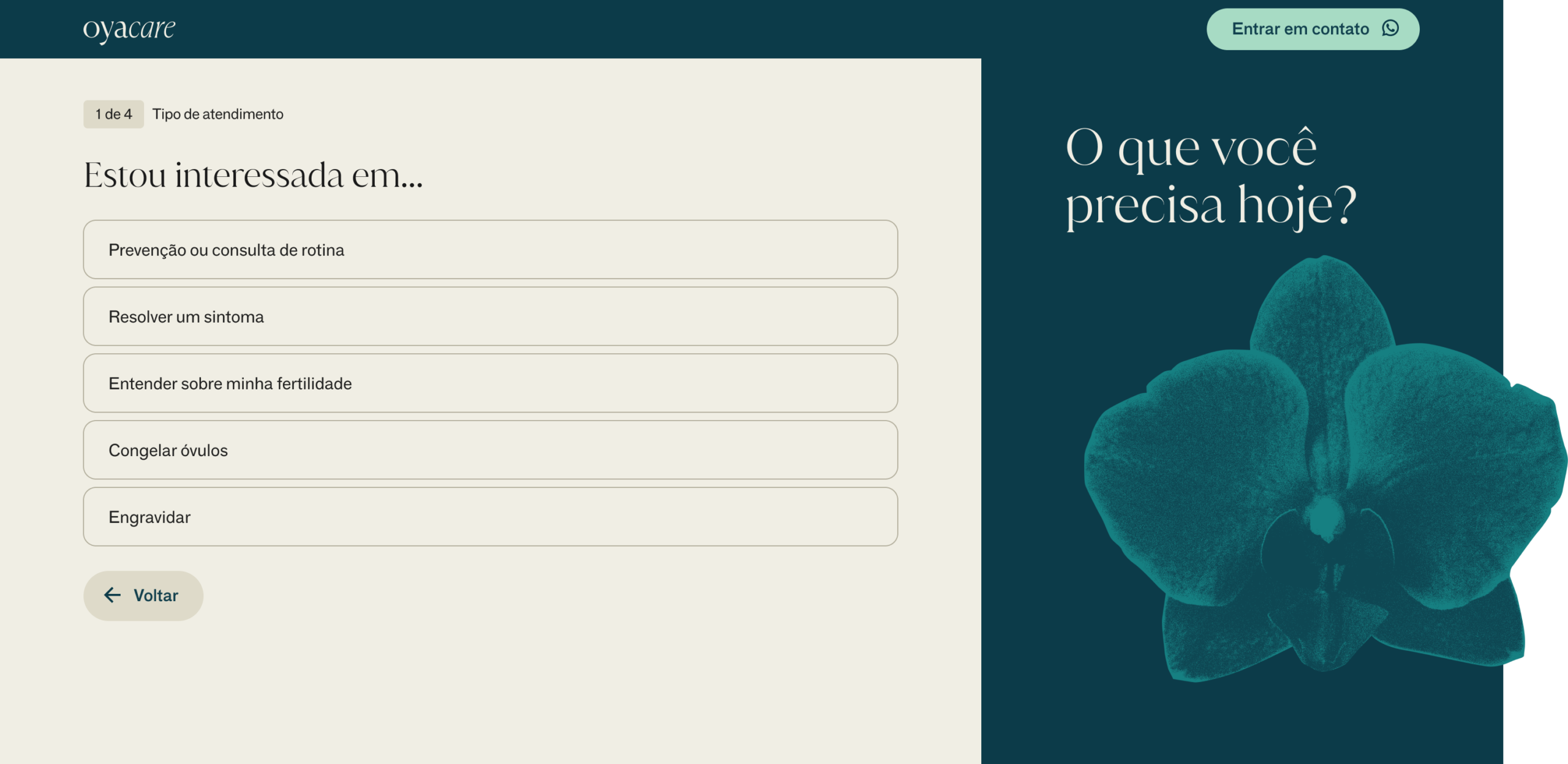
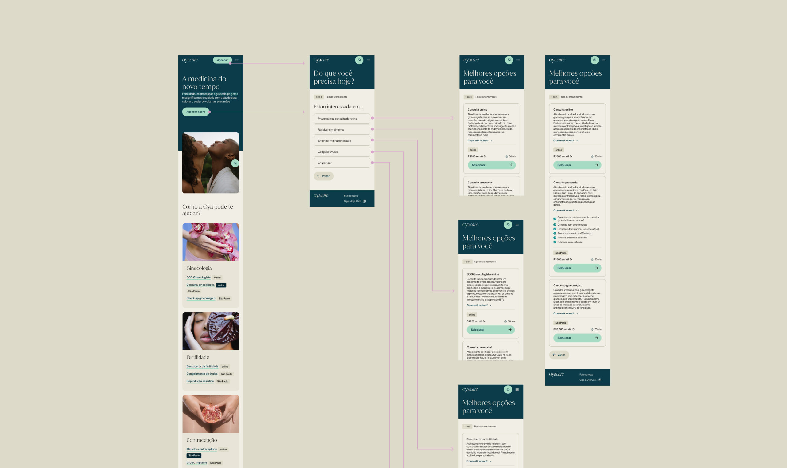
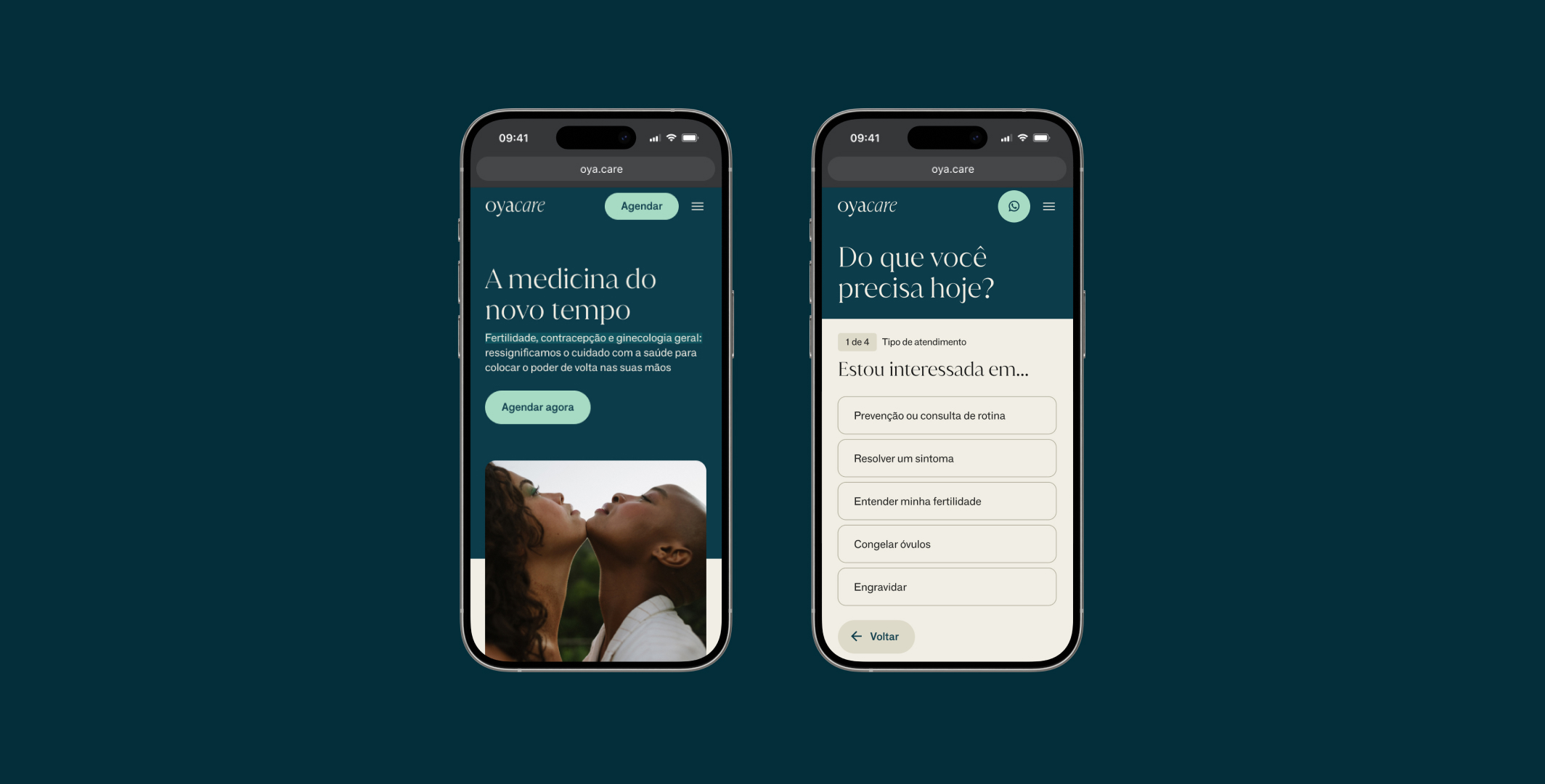
After redesigning the platform, the focus of Oya Care at the end of 2023 was fully on increasing conversion and my squad OKR was increasing website bookings by 100%.

Data revealed significant drop-offs throughout the booking funnel. Users struggled to understand which service best matched their needs, leading to uncertainty from the very first interaction on the homepage.

Impact

Combined with other product and marketing initiatives, the redesigned booking flow helped the team surpass its quarterly OKR, contributing to a increasing the website bookings by 166% increase in website bookings .

Approach

I led research to better understand the pains and needs at the first stage of the journey: how the patient’s seek for help, what are their doubts and to map the main decision factors when they decide to buy a service like Oya Care’s. The methodology I suggested combined in-depth qualitative interviews with a Jobs to Be Done approach to also uncover emotional and contextual drivers behind user decisions.

One key insight emerged: seeking healthcare support is often an emotionally sensitive moment, filled with uncertainty and anxiety.

The problem wasn’t a lack of available services. The problem was decision paralysis. Users were expected to understand medical specialties and choose the right service on their own before they could even start the booking process.

“I’m not sure whether I should see a gynecologist or another specialist to assess my fertility.” — Isabella, 30

Imagine being in Isabella’s position: unsure which specialist to look for, then being presented with eight different service options and no clear starting point.

Solution

One of the concepts I explored was a symptom-based assessment designed to guide users toward the most appropriate service for their needs.

To shape this direction, I reviewed market benchmarks, including AI-powered diagnostic and symptom-checking tools. While these solutions were inspiring, they were also expensive to build and introduced additional complexity that could create friction in the booking journey.

Instead, I proposed a simpler approach: helping users navigate the experience based on their health goals and needs rather than expecting them to understand medical specialties from the start.

I then restructured the entire booking flow. Previously, users had to choose between three main categories—gynecology, fertility, and contraception—which later branched into eight different services. This structure mirrored the informational section of the website, which was already performing well as a content and acquisition channel.

For the booking experience, however, I introduced a different approach. Rather than asking users to choose a specialty upfront, the flow started with their underlying need, such as treating a symptom, preventive care, understanding fertility options, freezing eggs or embryos, or planning a pregnancy.

Each need guided users toward a smaller set of relevant services, reducing uncertainty and helping them make decisions with greater confidence.

Usability test & feedback

Usability testing revealed there were still friction in the first decision point of the proposed solution, where users had to choose between gynecology and fertility services. Two out of three participants hesitated at this step, indicating uncertainty about the distinction between the two categories. Based on this feedback, we simplified the flow by surfacing the needs directly and removing an unnecessary layer of decision-making.

Team

Caroline Xavier • Tech Lead
Laura Máximo • Product Manager
Naiana Maia • Product designer
Livia Melandre • Product designer